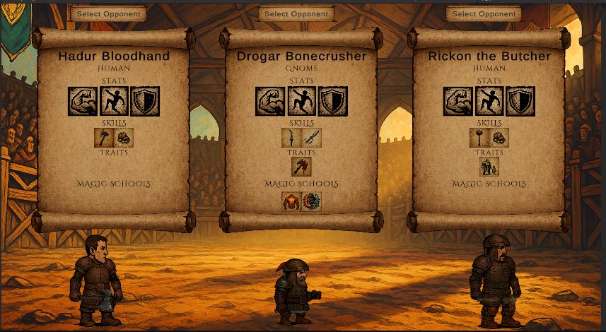
Devlog #8 – Opponent Selection UI: Icons, Tooltips, Polish
I'm still deep in the process of refining the Opponent Selection screen, which is turning out to be one of the most UI-heavy parts of the game so far. I’ve been working on:
-
Stat icons with contextual tooltips (e.g., “Stronger than you”, “Nimbler than you”, etc.)
-
Magic school icons — now loading properly from Resources after a minor path mismatch
-
Hover-based feedback for gear previews and character summaries
-
Cleaning up layout and spacing to fit both atmosphere and readability
It’s mostly small things, but they add up. I'm doing this solo, and even simple UI polish eats time — especially when you're juggling gameplay clarity with stylized design.
I'm aiming for something that feels gritty, tactical, and a bit theatrical — like an ominous lineup before the fight. The whole game is meant to feel like that moment just before combat: tense, uncertain, full of risk.
Here it is the result of the refining so far (feel free to compare with screenshots in other devlogs)
If you're reading this, feel free to drop a comment — I'd love to hear what you think so far or what kind of details you'd like to see in this type of game.
Thanks for following along.
Leave a comment
Log in with itch.io to leave a comment.